Google updates its iconic ‘G’ logo with a modern gradient design after a decade, aligning with AI trends. Here’s what’s changed and why it matters.

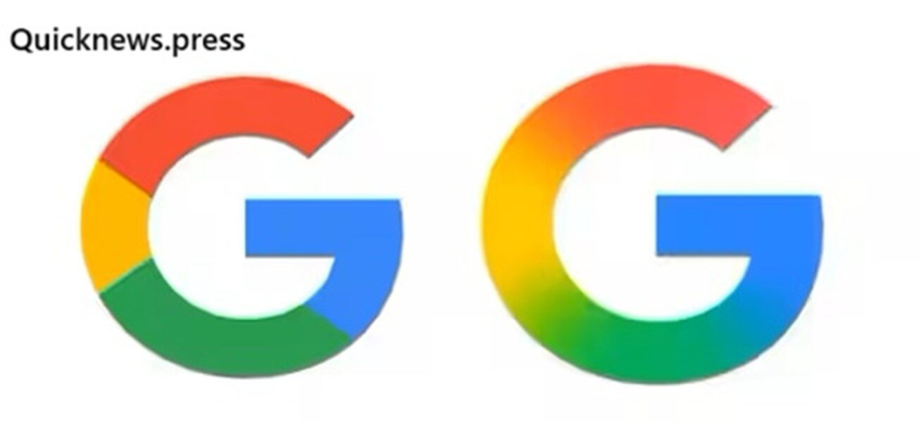
After ten years, Google has officially refreshed its iconic ‘G’ logo, introducing a more refined and futuristic look. The update, revealed on May 12, 2025, shows a smooth gradient style replacing the older flat-color design. This change isn’t just cosmetic—it signals Google’s evolving identity in the era of artificial intelligence and unified product design.
What’s Changed in the New Google ‘G’ Logo?
Sleek Gradient Replaces Flat Colors
The most visible change in the redesign is the use of a gradient blend of G oogle’s traditional red, green, yellow, and blue. Instead of distinct solid-color sections, the new ‘G’ offers a seamless transition between hues. This modern styling adds depth, clarity, and visual harmony—especially effective on high-resolution displays.
“The gradient design enhances brand fluidity and aligns visually with our AI-first strategy,” said a G oogle design insider. (source)
Visual Unity Across Google Products
This update reflects a growing trend within G oogle’s branding: consistency across platforms. The new ‘G’ mirrors design themes seen in Gemini, Google’s AI assistant, which also features a sleek gradient look. Expect this visual shift to cascade across other products like Chrome, Gmail, and Maps shortly.
Why Did Google Redesign the Logo?
G oogle isn’t known for frequent logo overhauls—its last major update was in 2015. So why now?
- AI Integration: With tools like Gemini, Bard (now integrated into Gemini), and AI-powered search experiences, Google is realigning its identity around artificial intelligence.
- Design Modernization: Gradients and minimalism dominate current UI/UX trends. This change helps Google remain visually contemporary.
- Brand Cohesion: A unified logo system across products boosts recognition and trust.
Learn more about Google’s evolution in our detailed look at Google Search changes.
A Look Back: Google Logo Evolution Over Time
G oogle’s logo history reflects its growth and maturity over the decades:
| Year | Update Description |
|---|---|
| 1998 | Original logo with serif font and bright colors. |
| 2010 | Subtle shading removed; colors became flatter. |
| 2015 | Introduced Product Sans font and the multi-colored ‘G’. |
| 2025 | Gradient ‘G’ introduced for modern, AI-forward look. |
Where and When Will You See the New Logo?
The rollout is already underway:
- iOS Users: The new logo is visible in the G oogle Search app.
- Android Users: Rolling out via Beta version 16.18.
- Pixel Devices: New design spotted first here.
- Full Rollout: Expected globally within the next few weeks.
Keep your apps updated to experience the new look.
Industry and Public Response
Reactions to the redesign have been mixed but mostly positive:
- 🎨 Designers appreciate the clean gradient and modern touch.
- 💬 Users on X (formerly Twitter) joked about noticing “something’s different but can’t tell what.”
- 🔍 Tech Analysts interpret the change as a signal of broader UI transformations at Google.
Some even speculate that the logo redesign might foreshadow changes in Google’s homepage UI or deeper integration of AI in core services.
Also read – https://quicknews.press/galaxy-s25-edge-launched-snapdragon-8-elite-chip/
Expert Commentary
We asked branding and UI/UX professionals what they think:
🔹 Julia R., Brand Strategist at UIhaus
“Google’s gradient ‘G’ subtly signals transformation. It’s a smart move to reflect the sophistication of AI without alienating users.”
🔹 Martin Lee, UX Director at NOMA Design
“Minimal updates like these show restraint. The logo still feels familiar, but it’s more forward-looking now.”
FAQs
1. Why did Google change its logo now?
Google updated its logo to reflect its evolving focus on AI, design trends, and brand cohesion.
2. Is the change only in the Search app?
No. It started with the Search app but will soon be seen across other G oogle platforms and devices.
3. Will this affect how G oogle services work?
Not at all. The redesign is purely visual and doesn’t impact user functionality or app performance.
4. Will Gmail, Chrome, or Maps get new logos too?
It’s likely. Given the trend, we may soon see matching gradient updates across all major G oogle products.
5. Is this the first time G oogle changed its ‘G’?
No. The last major change occurred in 2015, when the ‘G’ was introduced alongside a new typeface.
Final Thoughts
G oogle’s updated ‘G’ logo may look like a small change, but it carries significant meaning. It marks a shift toward AI-centric branding, seamless visual identity, and modern design. As the tech giant reshapes the digital landscape with tools like Gemini, this refreshed logo serves as a quiet but powerful signal of what’s ahead.
Call to Action
What do you think of Google’s new look?
Drop your thoughts in the comments below, share this article with a fellow Google fan, and follow us for more updates on tech design trends and AI innovation.


